Learning Auto Layout
Auto layout could be considered an everyday skill needed for an iOS developer. Last week I vowed to learn the ins-n-outs, so I’m starting from beginning -> using constraints in Interface Builder. Auto layout is a big subject, I’m going to add to this post as I as go along. I’ll update the resources pages with links to relevant matter, as well as, add links to the bottom of this post.
Why Use Auto Layout?
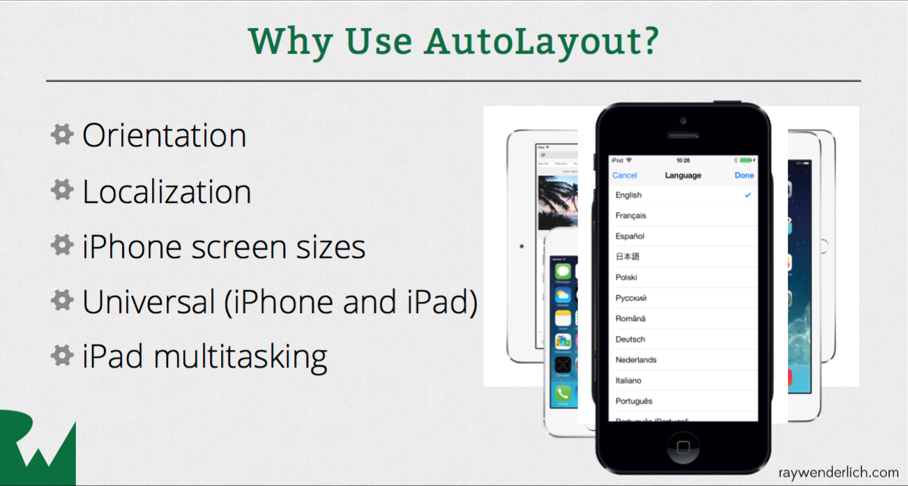
Most iOS developers are aware of the importance of supporting multiple devices and orientations, but localization is another very important aspect of auto layout. Here’s an image from RayWenderlich’s Auto Layout Series showing common reasons to use auto layout.

Basic Constraints
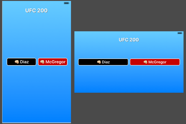
I’m starting off with the common situation of laying out buttons. I want the buttons to line up vertically and display on any device/orientation.
Blue Button
- Pin the left side to standard value.
- Align vertically centered (align center Y to superview.)
Red Button
- Pin the right side to standard value.
- Control drag to blue button and choose horizontal spacing, equal widths & baseline.
- Resolve Auto Layout by updating all frames.

Now both buttons are the same size and are distributed equally in all devices. Since the buttons use intrinsic values I wait until the end before updating frames. Tip: Open the Assistant Editor to the Preview page and you’ll be able to see how your constraints are effecting the layout without having to update frames.

Resuming AutoLayout after vacation.
Read more: